MAY 15, 2025, 12:06 AM
Doubling Mobile Conversion Rates to 4.5% for Customized Phone Cases
Doubling Mobile Conversion Rates to 4.5% for Customized Phone Cases
Doubling Mobile Conversion Rates to 4.5% for Customized Phone Cases
Doubling Mobile Conversion Rates to 4.5% for Customized Phone Cases
Conducted a UX/CRO audit for an e-commerce platform selling customized iPhone and Samsung cases. By addressing issues like MagSafe compatibility and shipping times, we increased conversion rates from 2.2% to 4.5% on mobile and from 5% to 7% on desktop.
Conducted a UX/CRO audit for an e-commerce platform selling customized iPhone and Samsung cases. By addressing issues like MagSafe compatibility and shipping times, we increased conversion rates from 2.2% to 4.5% on mobile and from 5% to 7% on desktop.
Conducted a UX/CRO audit for an e-commerce platform selling customized iPhone and Samsung cases. By addressing issues like MagSafe compatibility and shipping times, we increased conversion rates from 2.2% to 4.5% on mobile and from 5% to 7% on desktop.

OVERVIEW
OVERVIEW
OVERVIEW
Artpointone, a Shopify-based e-commerce platform specializing in customizable phone cases for iPhones and Samsung. Known for its high-quality prints and unique designs inspired by art, the brand aimed to convert its growing mobile traffic into loyal customers.
The goal is to increase mobile conversion rates up to at least 4% and significantly improve desktop performance by enhancing the user experience and optimizing the sales funnel through strategic design and CRO interventions.
Role
UX Design, CRO Strategy, UI Design Implementation & Funnel Monitoring
April 2024
Role
UX Design, CRO Strategy, UI Design Implementation & Funnel Monitoring
April 2024
Role
UX Design, CRO Strategy, UI Design Implementation & Funnel Monitoring
April 2024
BACKSTORY
BACKSTORY
BACKSTORY
I was brought on this project to apply my expertise in UX design and CRO strategy. I led user behavior analysis and crafted a design strategy to address pain points and optimize the mobile shopping experience. I also oversaw the redesign of key pages and ensured smooth implementation across the user journey.
And during this period, I was able to:
Identify and fix key issues through detailed analysis, making mobile navigation easier and reducing confusion on product pages.
Identify and fix key issues through detailed analysis, making mobile navigation easier and reducing confusion on product pages.
Identify and fix key issues through detailed analysis, making mobile navigation easier and reducing confusion on product pages.
Create a plan that focused on mobile-first improvements, urgency messaging, and showing products in context to boost engagement and conversions.
Create a plan that focused on mobile-first improvements, urgency messaging, and showing products in context to boost engagement and conversions.
Create a plan that focused on mobile-first improvements, urgency messaging, and showing products in context to boost engagement and conversions.
Lead the redesign of important pages, doubling mobile conversion rates to 4.5% and increasing desktop conversions from 5% to 7%.
Lead the redesign of important pages, doubling mobile conversion rates to 4.5% and increasing desktop conversions from 5% to 7%.
Lead the redesign of important pages, doubling mobile conversion rates to 4.5% and increasing desktop conversions from 5% to 7%.
Use dynamic monitoring to measure the impact of design changes, allowing for quick, user-focused updates for continuous improvement.
Use dynamic monitoring to measure the impact of design changes, allowing for quick, user-focused updates for continuous improvement.
Use dynamic monitoring to measure the impact of design changes, allowing for quick, user-focused updates for continuous improvement.
VISITORS WERE COMING, but the endings were not satisfying.
VISITORS WERE COMING, but the endings were not satisfying.
VISITORS WERE COMING, but the endings were not satisfying.
Artpointone, known for its vibrant customized phone cases, was struggling to convert users. Mobile conversion rates lingered at 2.2%, and desktop performance was stuck at 5%. While traffic numbers looked promising, the sales funnel had cracks that couldn’t be ignored.
The task was clear: uncover why users weren’t converting and rebuild a journey that turned browsers into buyers. Our goal wasn’t just incremental growth but a leap forward, setting a benchmark for both mobile and desktop experiences.
2.2%
2.2%
2.2%
Mobile conversion rates
Mobile conversion rates
5%
5%
5%
Desktop conversion rates
Desktop conversion rates

WHY BROWSE wHeN THEY WON’T commit to buying ???
WHY BROWSE wHeN THEY WON’T commit to buying ???
WHY BROWSE wHeN THEY WON’T commit to buying ???
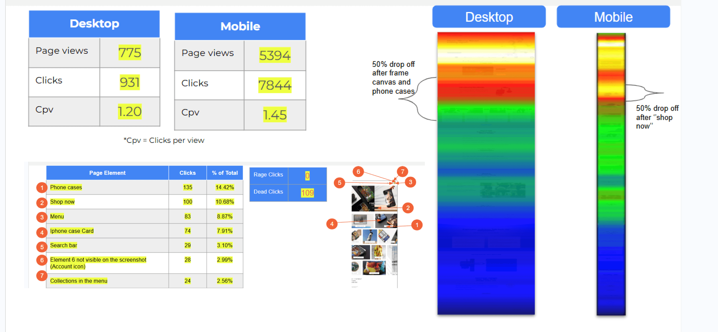
I conducted heatmaps, scroll analysis, and session recordings to paint a picture of the user behaviors. Users scrolled, clicked, and hesitated, often abandoning their journey on product pages.
Through Google Analytics and remote user testing, I discovered critical drop-offs, friction points that left potential customers confused and hesitant to convert.
Customer frustration stemmed from MagSafe compatibility, unsure about production and shipping times, and found our prices higher compared to cheaper competitors.
Customer frustration stemmed from MagSafe compatibility, unsure about production and shipping times, and found our prices higher compared to cheaper competitors.
Customer frustration stemmed from MagSafe compatibility, unsure about production and shipping times, and found our prices higher compared to cheaper competitors.
using data to expose the cracks in the funnel.
using data to expose the cracks in the funnel.
using data to expose the cracks in the funnel.
The audit further revealed the leaks in the funnel and glaring issues in the user journey.
The audit further revealed the leaks in the funnel and glaring issues in the user journey.
The audit further revealed the leaks in the funnel and glaring issues in the user journey.
57%
57%
57%
Drop-off on product detail pages (PDPs)
Drop-off on product detail pages (PDPs)
Drop-off on product detail pages (PDPs)
42%
42%
42%
of mobile users abandoned the product listing pages (PLPs)
of mobile users abandoned the product listing pages (PLPs)
of mobile users abandoned the product listing pages (PLPs)
Competitors like Casetify and Burga capitalized on trust-building elements like urgency messaging and clear product highlights, which were absent from this company's site.
Competitors like Casetify and Burga capitalized on trust-building elements like urgency messaging and clear product highlights, which were absent from this company's site.
Competitors like Casetify and Burga capitalized on trust-building elements like urgency messaging and clear product highlights, which were absent from this company's site.
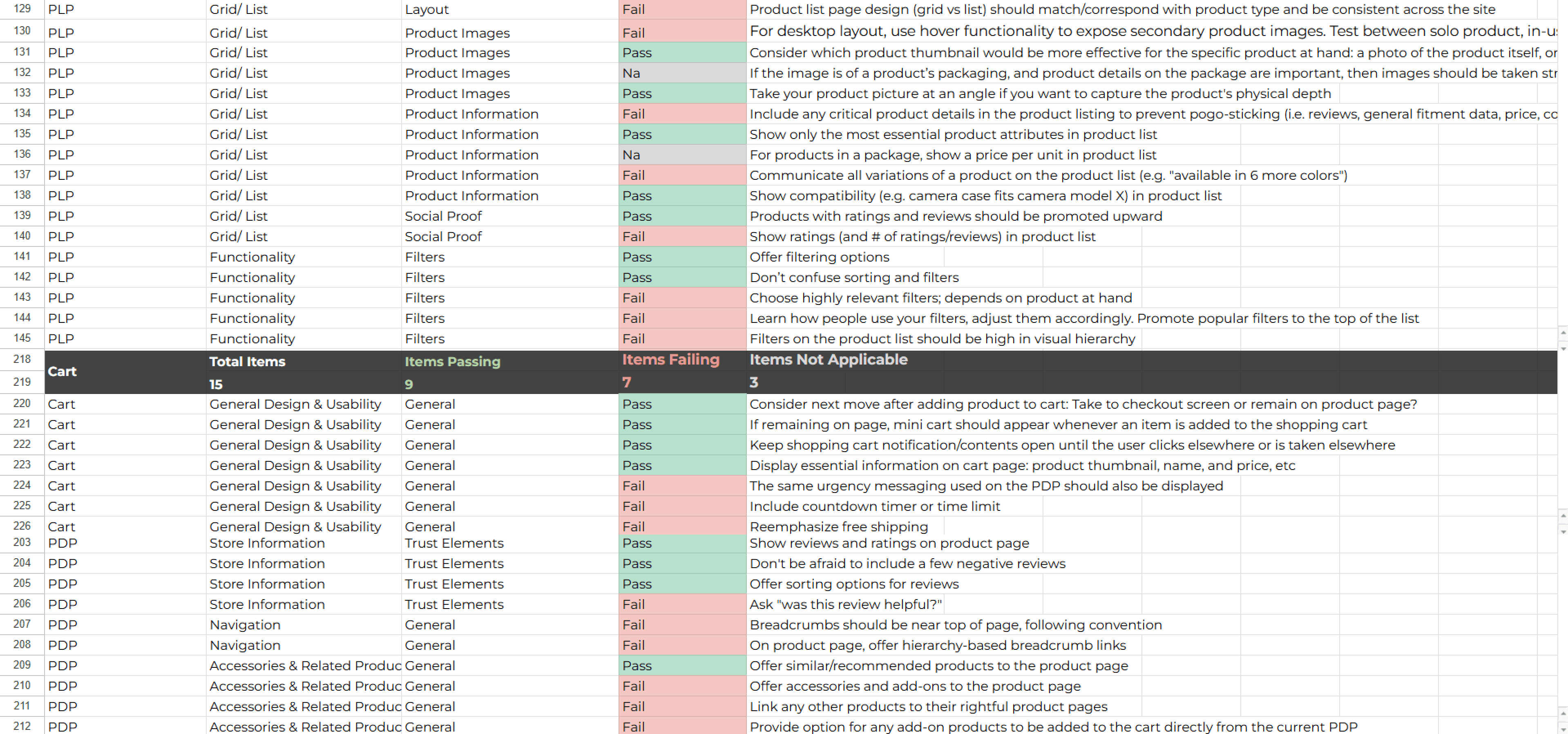
To further strengthen the evidences, I evaluated 260+ UX best practices identified 29 key opportunities for improvement, such as:
To further strengthen the evidences, I evaluated 260+ UX best practices identified 29 key opportunities for improvement, such as:
To further strengthen the evidences, I evaluated 260+ UX best practices identified 29 key opportunities for improvement, such as:
Optimizing for mobile-first experiences, given that 75% of site traffic came from mobile devices.
Optimizing for mobile-first experiences, given that 75% of site traffic came from mobile devices.
Optimizing for mobile-first experiences, given that 75% of site traffic came from mobile devices.
Introducing urgency elements like countdown timers and low-stock alerts to combat cart abandonment.
Introducing urgency elements like countdown timers and low-stock alerts to combat cart abandonment.
Introducing urgency elements like countdown timers and low-stock alerts to combat cart abandonment.
Enhancing product clarity to address user confusion about MagSafe compatibility and case finishes.
Enhancing product clarity to address user confusion about MagSafe compatibility and case finishes.
Enhancing product clarity to address user confusion about MagSafe compatibility and case finishes.
HypothesES WERE MADE TO Redefine Engagement, AND DEFINE ROADMAP
HypothesES WERE MADE TO Redefine Engagement, AND DEFINE ROADMAP
HypothesES WERE MADE TO Redefine Engagement, AND DEFINE ROADMAP
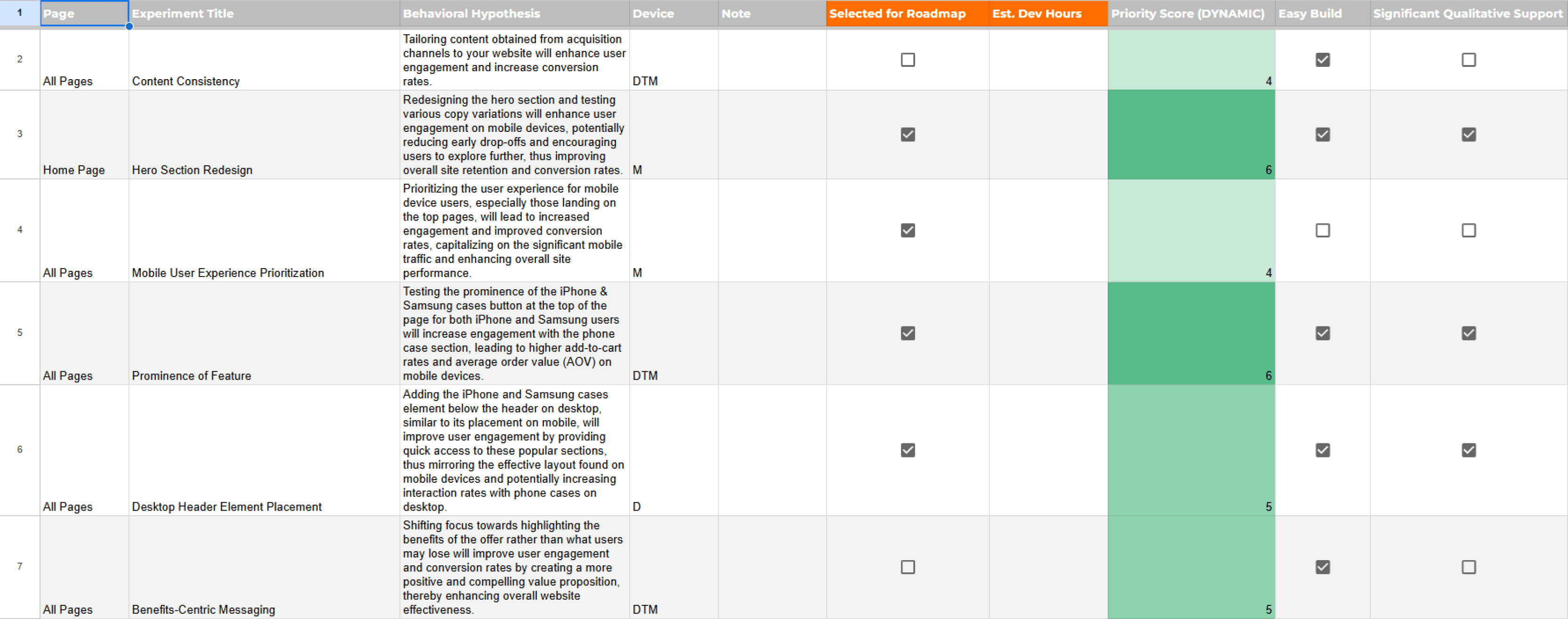
Proceeded to transform identified opportunities into a structured experiment database. Each opportunity was formulated into a behavioral hypothesis to address friction points and build trust.
Some key questions guided our focus, Could urgency building techniques improve PDP engagement? Would mobile-first navigation boost add-to-cart rates? These hypotheses became the foundation of our roadmap.
Opportunities were prioritized using a scoring framework that evaluated factors such as ease of implementation, friction reduction, motivation increase, impact on a large user base, etc.
Opportunities were prioritized using a scoring framework that evaluated factors such as ease of implementation, friction reduction, motivation increase, impact on a large user base, etc.
Opportunities were prioritized using a scoring framework that evaluated factors such as ease of implementation, friction reduction, motivation increase, impact on a large user base, etc.
16
16
16
Test/Site recommendations
Test/Site recommendations
Test/Site recommendations
4
4
4
High priority (5 or higher ranking)
High priority (5 or higher ranking)
High priority (5 or higher ranking)
3 - 5
3 - 5
3 - 5
Sources of research support
Sources of research support
Sources of research support
In a mobile-first world, we put users first.
In a mobile-first world, we put users first.
In a mobile-first world, we put users first.
With 75% of traffic on mobile, optimizing for these users became the priority. The redesigned hero section used bold CTAs and faster load times to grab attention instantly. Clear navigation placed iPhone and Samsung categories at users’ fingertips.
With 75% of traffic on mobile, optimizing for these users became the priority. The redesigned hero section used bold CTAs and faster load times to grab attention instantly. Clear navigation placed iPhone and Samsung categories at users’ fingertips.
With 75% of traffic on mobile, optimizing for these users became the priority. The redesigned hero section used bold CTAs and faster load times to grab attention instantly. Clear navigation placed iPhone and Samsung categories at users’ fingertips.

Shopping shouldn't be a task. It should be an experience that tells a story.
Shopping shouldn't be a task. It should be an experience that tells a story.
Shopping shouldn't be a task. It should be an experience that tells a story.
Bringing clarity and connection to the top of the fold. I redesigned the product listing page by prioritizing what mattered most, users’ needs. iPhone and Samsung cases were prominently brought to the top of the fold, ensuring quick access to the platform’s most sought-after products. Emotional, connecting words in the copy created a sense of belonging, making the experience feel personal and inviting.
Bringing clarity and connection to the top of the fold. I redesigned the product listing page by prioritizing what mattered most, users’ needs. iPhone and Samsung cases were prominently brought to the top of the fold, ensuring quick access to the platform’s most sought-after products. Emotional, connecting words in the copy created a sense of belonging, making the experience feel personal and inviting.
Bringing clarity and connection to the top of the fold. I redesigned the product listing page by prioritizing what mattered most, users’ needs. iPhone and Samsung cases were prominently brought to the top of the fold, ensuring quick access to the platform’s most sought-after products. Emotional, connecting words in the copy created a sense of belonging, making the experience feel personal and inviting.

With Convenience and Urgency in Action, We established browsing to buying
With Convenience and Urgency in Action, We established browsing to buying
With Convenience and Urgency in Action, We established browsing to buying
I reimagined product pages to prioritize ease and functionality. Breadcrumb navigation at the top made exploration intuitive. An upsell section showcased accessories like MagSafe rings, screen protectors, and lens protectors, encouraging users to enhance their purchase.
Expanded product options, including “matte” and “glossy” finishes, catered to diverse preferences. Detailed visuals compared slim vs. tough cases, giving users the power to make informed decisions.

These updates played key roles in elevating the user experience, turning curiosity into conversion
These updates played key roles in elevating the user experience, turning curiosity into conversion
These updates played key roles in elevating the user experience, turning curiosity into conversion
Turning Cart Friction Into Conversions
Turning Cart Friction Into Conversions
Turning Cart Friction Into Conversions
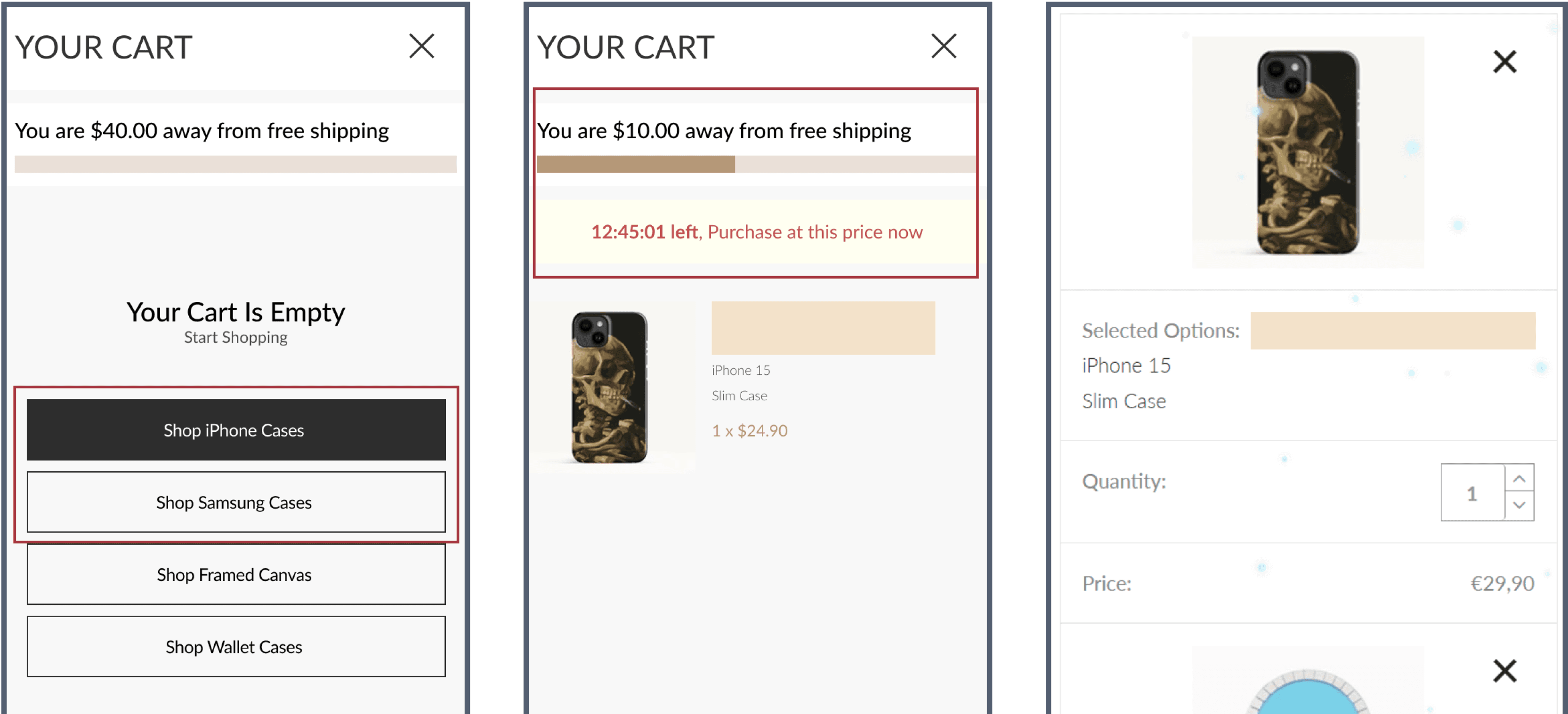
I optimized the cart page to become a conversion engine. On empty cart, quick links like “Shop iPhone Cases” directed users to relevant categories, smoothening navigation. A progress bar indicated how close users were to qualifying for free shipping, paired with a “Continue Shopping” button to encourage additional purchases.
Returning visitors were greeted with a persistent cart pop-up, maintaining continuity and saving time. These changes, along with urgency messaging integrated into the experience.
Funnel Monitoring Over A/B Testing
Funnel Monitoring Over A/B Testing
Funnel Monitoring Over A/B Testing
We shifted from traditional A/B testing to real-time funnel monitoring, allowing us to act immediately on observed user behaviors. Instead of waiting for theoretical test results, we decided to go for actionable insights that directly informed iterative improvements.
We shifted from traditional A/B testing to real-time funnel monitoring, allowing us to act immediately on observed user behaviors. Instead of waiting for theoretical test results, we decided to go for actionable insights that directly informed iterative improvements.
We shifted from traditional A/B testing to real-time funnel monitoring, allowing us to act immediately on observed user behaviors. Instead of waiting for theoretical test results, we decided to go for actionable insights that directly informed iterative improvements.
Professionally Managed A/B Testing and Implementation
Professionally Managed A/B Testing and Implementation
Professionally Managed A/B Testing and Implementation
Design Implementation and Funnel Monitoring
Design Implementation and Funnel Monitoring
Design Implementation and Funnel Monitoring
By continuously observing and adapting to live user interactions, we implemented impactful changes faster.
By continuously observing and adapting to live user interactions, we implemented impactful changes faster.
By continuously observing and adapting to live user interactions, we implemented impactful changes faster.
After 3 months, 4.5% and Counting
After 3 months, 4.5% and Counting
After 3 months, 4.5% and Counting
Over three months of monitoring, mobile conversion rates surged from 2.2% to 4.5%, and desktop conversions climbed from 5% to 7%. Also, average order value (AOV) increased by 13.2%, while cart abandonment rates dropped significantly, reflecting the success of user-focused optimizations.
Over three months of monitoring, mobile conversion rates surged from 2.2% to 4.5%, and desktop conversions climbed from 5% to 7%. Also, average order value (AOV) increased by 13.2%, while cart abandonment rates dropped significantly, reflecting the success of user-focused optimizations.
Over three months of monitoring, mobile conversion rates surged from 2.2% to 4.5%, and desktop conversions climbed from 5% to 7%. Also, average order value (AOV) increased by 13.2%, while cart abandonment rates dropped significantly, reflecting the success of user-focused optimizations.
For me, these weren’t just metrics, they were milestones. Every change mattered, from smooth navigation to expanded product options,
For me, these weren’t just metrics, they were milestones. Every change mattered, from smooth navigation to expanded product options,
For me, these weren’t just metrics, they were milestones. Every change mattered, from smooth navigation to expanded product options,
Sessions Distribution
Sessions Distribution
Sessions Distribution
67.3K
67.3K
67.3K
mobile sessions
mobile sessions
mobile sessions
22.12K
22.12K
22.12K
desktop sessions
desktop sessions
desktop sessions
Improved Conversion Rates
Improved Conversion Rates
Improved Conversion Rates
2.2% ~ 4.5%
2.2% ~ 4.5%
2.2% ~ 4.5%
on mobile
on mobile
on mobile
5% ~ 7%
5% ~ 7%
5% ~ 7%
on desktop
on desktop
on desktop
Improved Purchases
Improved Purchases
Improved Purchases
1,468 ~ 3,004
1,468 ~ 3,004
1,468 ~ 3,004
units sold on mobile
units sold on mobile
units sold on mobile
1,113 ~ 1,558
1,113 ~ 1,558
1,113 ~ 1,558
units sold on desktop
units sold on desktop
units sold on desktop
Improved Average Order Value (AOV)
Improved Average Order Value (AOV)
Improved Average Order Value (AOV)
13.2%
13.2%
13.2%
on mobile sessions
on mobile sessions
on mobile sessions
Key Takeaways from the Journey
Key Takeaways from the Journey
Key Takeaways from the Journey
The biggest takeaway? Great design is about problem-solving, not just aesthetics. By combining user insights with clear, actionable strategies, any user journey can be transformed into a seamless and delightful experience.
This project highlighted the value of empathy in design. Understanding users’ frustrations and needs allowed us to developed solutions that not only solved pain points but also elevated the overall experience. Testing bold ideas and iterating based on real-world data ensured that every change was impactful.
FILL YOUR GLASS…
FILL YOUR GLASS…
FILL YOUR GLASS…
Leading the design Journey from Travel Services to Global Fintech
Leading the design Journey from Travel Services to Global Fintech
Leading the design Journey from Travel Services to Global Fintech
Leading the design Journey from Travel Services to Global Fintech
WRITE ME, I WRITE BACK
© 2025 Designed & Developed In Love and Honesty to Grow.
WRITE ME, I WRITE BACK
© 2025 Designed & Developed In Love and Honesty to Grow.
WRITE ME, I WRITE BACK
© 2025 Designed & Developed In Love and Honesty to Grow.
WRITE ME, I WRITE BACK
© 2025 Designed & Developed In Love and Honesty to Grow.